


Logo Design Trends Startups Should Embrace (and Which Ones to Avoid)
Did you know that it takes consumers just 10 seconds to form an impression of your brand logo, but nearly 5-7 brand interactions before they remember it? For startups operating with limited resources and fierce competition, your logo isn't just a design element—it's potentially your most valuable brand asset. As we navigate through 2025, the evolution of design principles, consumer psychology, and digital interfaces has dramatically reshaped what makes an effective logo for emerging businesses.
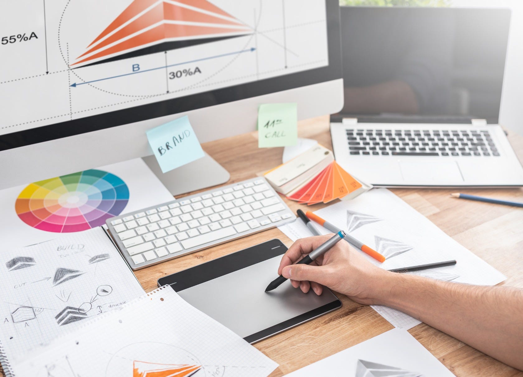
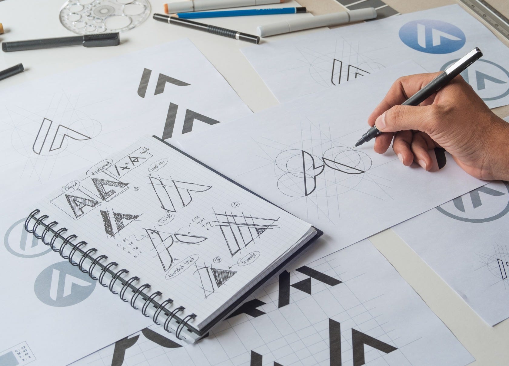
In this comprehensive guide, I'll walk you through the cutting-edge logo design trends that can help your startup stand out, connect with your audience, and adapt to various platforms. Just as importantly, I'll highlight the dated or ineffective trends that could undermine your brand's perception. With 15+ years in the industry, I've witnessed firsthand how the right logo can accelerate a startup's growth trajectory—and how the wrong one can silently sabotage it.
Why Logo Design Matters More Than Ever for Startups
Before diving into specific trends, let's understand the heightened importance of logo design in today's business landscape.
For startups, a logo serves as the cornerstone of brand identity, often being the first point of contact with potential customers, investors, and partners. Research from the Journal of Marketing shows that effective visual branding can increase consumer recognition by up to 80%, while poor design choices can actively repel approximately 42% of consumers from engaging with a brand.
"Your logo is the face of your company in an increasingly visual economy," explains Sarah Chen, Design Director at Founders Factory. "For startups specifically, it needs to do more heavy lifting than established brands' logos because you don't have decades of brand equity backing you up."
Looking for a LOGO that fits your style? AI Logo Maker makes it easy to create something clean and unique - no design skills needed! Just a few simple inputs and it does the rest.
With digital transformation accelerating, your logo now needs to function seamlessly across:
Mobile interfaces (often at extremely small sizes)
Social media profiles and content
Website headers and favicons
Physical products and packaging
Pitch decks and investor materials
AR/VR environments
This multi-platform reality has fundamentally changed what makes a logo effective.
Logo Design Trends Startups Should Embrace in 2025
1. Responsive Logo Systems
Perhaps the most significant evolution in logo design is the shift from static logos to responsive logo systems. These adaptable designs automatically adjust their complexity, orientation, and elements based on where they appear.
A responsive logo system typically includes:
Primary logo (full version with all elements)
Secondary logo (simplified version)
Logomark/icon (the most reduced version)
Spacing and sizing variations
Financial technology startup Razorpay exemplifies this approach perfectly. Their full logo includes both their distinctive 'R' symbol and wordmark, but their system allows them to use just the 'R' symbol in constrained spaces like app icons or social media profiles.
"The days of having a single logo file are long gone," notes Miguel Rodriguez, Creative Director at DesignStudio. "Startups need logo systems that function across dozens of different contexts while maintaining brand recognition."
2. Variable Logos and Dynamic Branding
Taking responsiveness a step further, variable logos change based on context, user behavior, or data inputs. This approach creates living logos that reflect the dynamic nature of digital products.
Examples include:
Logos that change colors based on user preferences or actions
Animated variations that respond to scrolling or interaction
Data-reactive elements that visualize information through the logo
Blockchain startup Chain utilized this approach with a logo that subtly animates to represent transaction activities, making their abstract service more tangible and engaging.
"Variable logos represent the fusion of brand identity and user experience," explains Joanna Chen, founder of DesignThink. "They transform static identities into interactive brand moments."
3. Minimalist Geometry with Character
Geometric minimalism continues to dominate startup logo design, but with an important evolution: distinctive character elements that prevent the clinical feeling that plagued earlier minimalist designs.
The most successful startup logos in this category feature:
Clean geometric foundations
Limited color palettes (often just 1-2 colors)
One distinctive "character element" that creates memorability
Perfect mathematical balance and optical adjustments
Health-tech startup Forward demonstrates this beautifully with their logo—a simple geometric shape with a distinctive opening that creates forward momentum while maintaining minimal simplicity.
"The challenge with minimalism isn't creating something simple—it's creating something simple that's also unique and ownable," says Thomas Yang, Design Lead at Notable. "That's where the character element becomes essential."
4. Neo-Brutalist Typography
Typography-based logos have gained significant traction, with neo-brutalism offering a distinctive approach that feels both modern and authoritative.
Neo-brutalist typography in logos features:
Bold, heavy letterforms
Intentionally unrefined edges or details
High contrast between elements
Raw, unembellished presentation
Productivity startup Linear has embraced this approach with a wordmark that conveys technical authority through its unapologetically bold, structured typography.
"Neo-brutalist typography cuts through the noise," explains typography designer Lisa Mullen. "It represents honesty and directness—values that resonate strongly with today's consumers who are tired of overly polished corporate aesthetics."
5. Meaningful Simplification
Many successful startups are embracing strategic simplification—reducing their logos to their most essential elements while ensuring those elements carry significant meaning.
This approach involves:
Stripping away decorative elements
Enhancing the conceptual significance of what remains
Ensuring each component serves multiple purposes
Creating visual metaphors that connect to the brand story
Fintech startup Wise (formerly TransferWise) exemplifies this trend with their logo—a simple line that forms both a 'W' and represents the seamless transfer of money across borders.
"The most powerful logos aren't just visually simple—they're conceptually dense," notes brand strategist Marcus Lee. "Each element carries multiple layers of meaning, making the simplicity work harder."
6. Authentic Imperfection
Pushing back against the perfect symmetry trend of previous years, many successful startup logos now incorporate subtle asymmetry or intentional imperfections that create visual interest and human connection.
These authentically imperfect elements include:
Slightly irregular shapes
Hand-drawn elements within geometric structures
Organic textures or edges
Deliberate optical adjustments
Sustainable fashion startup Allbirds uses a logotype with subtly imperfect letterforms that reinforce their natural, handcrafted brand values.
"Perfect symmetry can feel cold and corporate," explains Jessica Wong, founder of Artisanal Design. "Strategic imperfection signals humanity and authenticity—critical qualities for startups looking to build emotional connections."
7. Generative AI-Enhanced Design
The integration of AI in logo design has moved beyond novelty to become a sophisticated design approach. Today's most successful AI-enhanced logos are created through human-AI collaboration rather than full automation.
Effective implementations include:
Using AI to explore vast design variations
Refining AI outputs with human design expertise
Creating parametric design systems that can evolve
Testing logo effectiveness through AI-powered eye tracking and recognition studies
Startup Notable pioneered this approach, using their own AI tools to generate hundreds of logo variations before their design team refined the final mark.
"AI doesn't replace designers—it expands our creative horizons," says Alex Rivera, co-founder of DesignAI. "The most successful startups use AI as a collaborative tool rather than a replacement for human creativity."
Logo Design Trends Startups Should Avoid
1. Overused Geometric Abstractions
While geometric minimalism can be effective, certain geometric configurations have become so overused that they've lost impact.
Specifically avoid:
Circular letter arrangements (particularly for the letters 'O', 'D', and 'Q')
Stacked geometric shapes without meaningful relationships
The ubiquitous "swoosh" or arc
Basic letter forms within simple shapes (square, circle, triangle)
"There's nothing inherently wrong with geometric designs," clarifies brand consultant Maria Santos. "The problem is when they lack distinctive characteristics that make them ownable and memorable. Thousands of startups have circular logos with abstract meanings—and consumers can't tell them apart."
2. Clichéd Industry Symbols
Each industry has developed visual shorthand that has become dangerously overused.
Avoid these industry clichés:
Tech: circuit boards, pixels, power buttons
Finance: arrows pointing upward, coins, shields
Health: heartbeat lines, crosses, leaves
Sustainability: green leaves, recycling arrows
Education: books, graduation caps, pencils
"Using these symbols is essentially announcing 'we couldn't think of anything original,'" warns creative director Chen Wei. "They create immediate mental categorization without distinctiveness—the opposite of what a startup needs."
3. Trend-Chasing Without Strategic Purpose
Perhaps the most dangerous trend is following aesthetic movements without connecting them to brand strategy.
Examples include:
Using gradients because they're popular, not because they represent your brand values
Adopting retro styles without relevance to your audience or offering
Implementing 3D effects simply because they're trending
"Chasing visual trends without strategic alignment creates a fundamental disconnect," explains brand strategist Amara Johnson. "Your logo should reflect your brand's core identity, not current design fashion."
4. Complexity That Doesn't Scale
Many startups still fall into the trap of creating logos with elements that become illegible or messy at smaller sizes.
Problematic elements include:
Fine details that disappear at small scales
Intricate illustrations that become blurry when reduced
Multiple thin lines placed close together
Small text or taglines incorporated into the logo
"Your logo needs to work on a billboard and as a favicon," reminds UX designer James Chen. "If it fails at either extreme, it's not serving your brand."
5. Gimmicky Animation
While motion design has become essential, many startups overuse animation effects that quickly become tiresome or distracting.
Avoid:
Logos that constantly move without user interaction
Complex animations that delay page loading
Motion that doesn't relate to brand meaning
Animations that become annoying with repeated viewing
"Animation should enhance meaning, not just add movement for movement's sake," advises motion designer Rachel Kim. "Every motion element should reinforce your brand story."
How to Implement These Trends Successfully
Work With Experienced Designers
The most successful startup logos come from collaboration with experienced designers who understand both current trends and timeless principles.
"The right designer isn't necessarily the most expensive," advises startup founder Michael Zhang. "Look for someone who asks deep questions about your business model, target audience, and long-term vision before even opening their design software."
When evaluating designers, look for:
A diverse portfolio showing range and adaptability
Case studies explaining their design process
Experience specifically with startup branding
Understanding of technical requirements across platforms
Test Your Logo Extensively
Before finalizing your logo, comprehensive testing is essential.
Effective testing includes:
Recognition testing (can people remember your logo after brief exposure?)
Meaning alignment (does it convey your intended brand attributes?)
Technical testing across all platforms and sizes
Competitive differentiation analysis
Cultural and linguistic checks for unintended meanings
"We tested our logo at 16×16 pixels, on billboards, in dark mode, in black and white, and alongside our top competitors," shares Emma Williams, founder of Everly. "Each test revealed improvements we would have missed otherwise."
Plan for Evolution, Not Revolution
Smart startups design logos with controlled evolution in mind—anticipating how the mark might mature as the company grows.
"Your initial logo should contain the DNA of what it might become in five years," suggests brand evolution specialist David Chen. "Great logos evolve gradually, maintaining recognition while reflecting company growth."
Case Studies: Startup Logo Success Stories
Notion: Simplicity with Purpose
Productivity tool Notion demonstrates perfect execution of meaningful simplification. Their logo—a simple "N" constructed from basic geometric shapes—scales perfectly across all sizes while subtly suggesting the building blocks that form the core of their product offering.
What makes it work:
The logo functions perfectly at favicon size
The geometric construction feels both modern and timeless
The design subtly references the product's block-building functionality
It avoids productivity tool clichés (checkmarks, calendar icons, etc.)
Figma: Dynamic Identity System
Design tool Figma created a variable logo system that brilliantly reflects their product's functionality.
Their approach includes:
A core logo that maintains recognition across contexts
Variable components that can transform based on specific design uses
A distinctive color system that works in both light and dark modes
Animation that reinforces the collaborative nature of their product
"Figma's logo system works because it practices what they preach," notes design systems specialist Jenna Park. "Their logo reflects the flexibility and precision of their own product."
Stripe: Evolution Done Right
Payment processor Stripe demonstrates perfect logo evolution—moving from their original wordmark to a distinctive 'S' symbol that maintains brand recognition while gaining versatility.
Their process included:
Retaining core brand colors through the transition
Gradually introducing the symbol alongside the wordmark
Extensive testing across payment interfaces
Creating a comprehensive responsive system
"Stripe's logo evolution shows how thoughtful planning creates long-term brand equity," explains brand consultant Maya Rodriguez. "They didn't start over—they evolved intentionally."
Tools and Resources for Startup Logo Design
Professional Design Partners
DesignStudio, Pentagram, and Collins for high-end agency work
Specialized startup branding firms like Red Antler and Ueno
Platforms like Upwork and Dribbble for finding independent designers
DIY Design Tools (with cautions)
Figma and Sketch for those with design experience
Logomaker AI and Looka for initial concept exploration (not final logos)
Canva for basic implementation after professional design
Testing Resources
UserTesting for gathering consumer feedback
Mechanical Turk for quick recognition studies
Social media A/B testing for gathering initial impressions
BrandMark.io for technical evaluation
Conclusion: Beyond Aesthetics
As we've explored throughout this article, effective logo design for startups in 2025 goes far beyond visual appeal. The most successful logos serve as functional business tools that communicate values, create recognition, and adapt to an ever-expanding digital ecosystem.
The trends worth embracing—responsive systems, meaningful simplification, and authentic imperfection—all share a common thread: they prioritize function alongside form. Meanwhile, the trends to avoid—overused geometrics, industry clichés, and gimmicky effects—typically sacrifice substance for style.
Remember that your logo is the foundation of your visual brand, but it's just one element of a comprehensive identity system. When aligned with your broader brand strategy, communication style, and user experience, your logo becomes more than a mark—it becomes the visual encapsulation of your startup's purpose and promise.
The most valuable advice for any startup founder: invest time in your logo development process. The upfront investment in thoughtful design will pay dividends throughout your company's growth journey.